Email design best practices: How to increase Click Rates and Conversions in Klaviyo
Most brands think email design is about aesthetics.
Beautiful images, polished layouts, everything looks “pretty”. But despite that effort, performance often stagnates. Click-through rates remain low and the revenue underdelivers.
The problem isn’t effort. It’s direction.
High-performing email design is not only about how an email looks. It’s about how it guides behavior.
The best emails are still on brand, but also not most visually complex.
No-one reads emails
Alright, this sounds harsh, but the point is: we’re bombarded with content from all sides (especially in the inbox), so the best thing you can do as a marketeer is to make your emails easy to scan.
As compared to websites, which are designed for exploration, an email is designed for direction.
When you overload an email with content, you introduce friction. Strong email marketing design is built on the question “What do we want the reader to do?”
The hidden deliverability issue: image-only emails
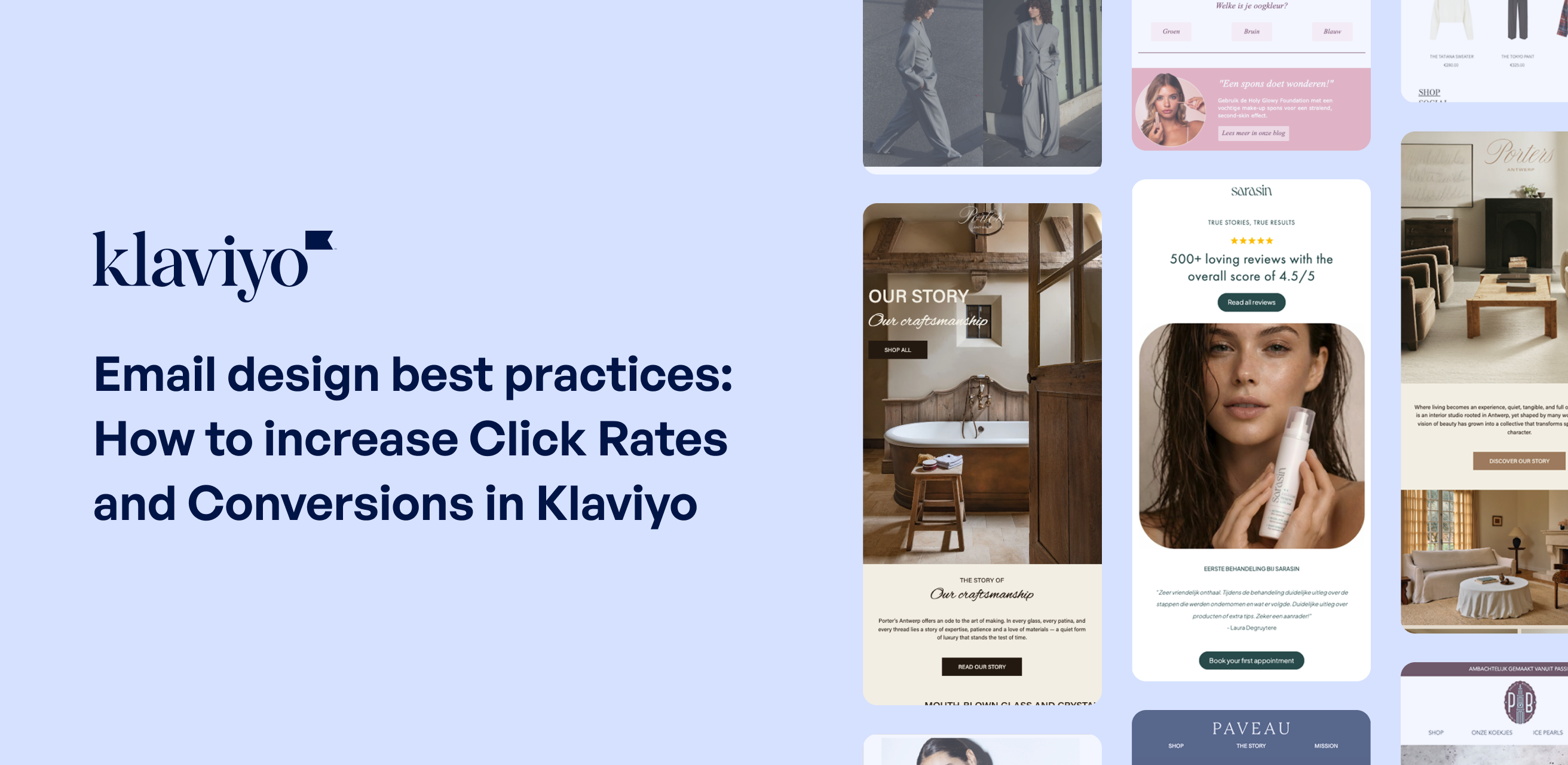
A surprisingly common mistake in Klaviyo email design is the use of image-only emails. These are emails where all content is embedded inside a single image or a series of images.
In email clients like Outlook, and often in Gmail, images are blocked by default. This means the recipient opens your email and sees a blank screen or a “display images” prompt.
The solution is not to remove visuals, but to build hybrid emails. That means combining strong imagery with live text, structured layouts and clear, clickable buttons.
This ensures your email performs, even when images don’t load.
Why CTA hierarchy matters more than design trends
Even well-designed emails often underperform because of weak call-to-action strategy.
In Klaviyo, we frequently see emails with multiple competing CTAs, unclear button copy, or buttons that visually blend into the design. When everything is important, nothing is.
Your primary call to action should stand out immediately, through color contrast, spacing, and placement and preferably above the fold (so before a customer needs to scroll down).
It should also be clear and action-oriented. Imagine if the person haven’t read but only scanned your email, is it’s still clear what the main goal of it is?
Less content, more clicks: the role of curiosity
Remember: less information often leads to more engagement
When you fully explain everything inside the email, you remove the need to click. But when you create just enough context and leave a gap, curiosity takes over.
Instead of sending dense, information-heavy campaigns, use email as a teaser channel.
This shift alone can significantly improve click-through rates and conversion rates.
The real goal of email design
Email design is not only about making it look beautiful.
It’s about increasing:
- Click-through rates
- Conversion rates
- Revenue from flows and campaigns
And ultimately, building a system where every email has a clear purpose within the customer journey.
Final thoughts: design for action, not aesthetics
If your Klaviyo emails look great but aren’t converting, the issue is rarely visual quality. It’s usually a lack of focus, hierarchy and direction. Is it time to redesign your emails?